Evaluating Price Action Signals in Real Time
Reading a price action signal is one skill. Evaluating its quality while you are in the moment, under time pressure, without the benefit of hindsight is an entirely different one. This is where most intermediate traders stall.

Learning Path Stage 2: Reading Charts
Learning Level 5: Evaluation
Stop Trading Every Blip on Your Screen
Most retail traders can spot a basic price action signal after about twenty minutes of reading a blog. Pins, engulfing candles, dojis, double tops… the geometry is dead simple. Your brain is naturally hardwired to find these shapes.
The actual problem isn't spotting the signal; it’s real-time evaluation.
It’s the high-pressure capability to look at a live candlestick, run it through a multi-layered quality assurance checklist, and decide exactly how much probability weight to give it before the market moves on without you.
This is the exact user friction point that separates chart-watching hobbyists from professionals who actually execute an edge.
1. The Five Dimensions of Signal Quality
Think of a price action signal as a user interface notification. Just because a notification pops up doesn't mean it’s critical system data; sometimes it's just spam. To filter out the noise, every signal must be scored across five distinct dimensions:
Dimension 1: Level Quality (The Spatial Layer)
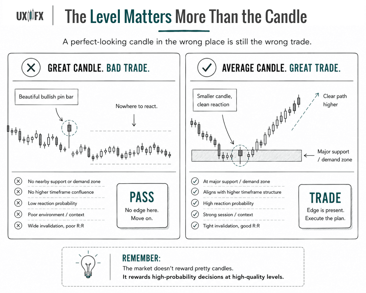
A price action signal is only as reliable as the structural grid it appears on. If you print a textbook bullish pin bar in the middle of absolute nowhere, it’s not a setup. That’s just a random candle having an identity crisis.
Reaction Count: Has this level historically produced aggressive buyer or seller displacement?
The Wear and Tear: Is this a clean, untouched level (high spring tension) or a multi-tested level that has been chipped away so many times the orders are exhausted?
Structural Confluence: Does this line up with a major high-timeframe order block or premium/discount zone?
Lines vs. Zones: Is it a fragile, single price point or a robust structural zone? (Spoiler: The market treats single lines like suggestions and zones like brick walls).
Dimension 2: Candle Character (The Physics Layer)
Not all candlesticks of the same name are built equal. You have to evaluate the raw physics of the print itself:
Relative Mass: How large is this signal candle compared to the last 10 or 20 candles? An oversized rejection candle shows institutional capital stepping in. An average-sized candle is just retail noise.
The Close: Where did the candle close relative to its entire range? A pin bar closing in the extreme top 15% of its range is a dominant statement. One closing near the midpoint is a committee meeting that couldn't reach a decision.
Velocity: Did this candle snap back violently in 30 seconds, or was it a slow, agonizing 5-minute grind? Speed reveals displacement.
Dimension 3: High-Timeframe Alignment (The Vector Layer)
An intraday bullish signal on a 5-minute chart carries massive weight when the daily trend is heavily upward and the entry sits cleanly above major daily support. Counter-trend signals can work, but they require a mountain of exceptional structural evidence to compensate for the fact that you are actively trying to swim upstream against an institutional current.
Dimension 4: Session & Time Context (The Environment Layer)
The exact same geometric candlestick pattern holds completely different statistical weight depending on the clock:
The Session Context | Institutional Participation | Signal Reliability |
London Open / NY Overlap | Peak. Real volume, real narrative depth. | High. Setups tend to follow through. |
Thin Asian Hours (for EU/US pairs) | Low. Algorithmic market makers balancing inventory. | Poor. High occurrence of fakeouts and noise. |
Pre-High Impact News (FOMC/CPI) | Zero. Smart money clears the book. Spreads widen. | Deadly. Signals are purely erratic coin-flips. |
Dimension 5: The Invalidation Profile (The Risk Layer)
Before you even touch your mouse, you must identify the structural coordinates of the trade: Where is the thesis dead? The tighter the logical distance between your market entry and your structural invalidation point, the higher your potential R-multiple. If the confirmation is ambiguous or the invalidation point requires a different zip code, the trade is broken. Pass.

2. The Real-Time Order of Operations
You cannot be reactive. If you are noticing a signal after the candle has already closed and run away, you are chasing. Professional chart reading requires a proactive pipeline:
Step 1: Spatial Pre-Mapping: You must know where your key levels are hours before price gets there. When price approaches a pre-mapped zone, your cognitive load is low because you are already waiting for the market to act.
Step 2: The 15-Second Macro Check: Zoom out to the higher timeframe. Is this signal working in harmony with macro structure, or are you trying to buy into a collapsing daily waterfall?
Step 3: Grade the Print: As the execution candle closes, check its character. Is it a high-tier print (huge wick, closing at the extreme edge, high relative volume)?
Step 4: The Environmental Filter: Check the clock. What session is this? Is there a central bank chair about to speak in ten minutes?
Step 5: Calculate the Math: Pinpoint the exact invalidation level. Measure the distance. Let that distance solve your position size to lock in your fixed dollar risk. If the risk-to-reward ratio doesn't meet your minimum threshold, let it go.

3. Three Fatal Evaluation Bugs
Bug 1: Loving the Shape, Ignoring the Level
Traders will post a picture-perfect pin bar on social media and wonder why it failed. The answer is almost always: Because it occurred in the middle of a random structural void. The level is the primary system factor. The candle print is merely the confirmation trigger.
Bug 2: Isolated Geometry
Evaluating a candlestick pattern without referencing the dominant trend is like reading a single sentence of a book and assuming you know the entire plot. The macro trend establishes the underlying probability distribution before the candle even begins to form.
Bug 3: The "Obvious Setup" Delusion
The most dangerous setups on earth are the ones that look so perfect they make your soul happy. They trigger an immediate spike in human confidence, which causes you to bypass your risk parameters and trade too large.
Your Can Even Use a Scorecard While You Learn
The checklist exists precisely to protect you from the moments when your own brain is screaming that a setup is a "sure thing." The market has no obligation to honor a textbook diagram. Apply the same ruthless scrutiny to the beautiful signals as you do to the marginal ones.

4. Compounding Evaluation Speed
When you start practicing this structured approach, it will feel frustratingly slow. Your brain will struggle to process the level, the candle size, the session clock, and the macro vector all at once before the market snaps away. That is completely normal cognitive friction.
To accelerate this processing speed, you need structured feedback loops. After every session, write a single, clinical sentence in your log regarding your evaluation performance:
"Passed on a clean 5-minute NY open pin bar because it was printed directly into major 4-hour resistance; process executed perfectly."
By forcing your brain to explicitly define the quality rating of your signals day after day, you move the checklist from conscious, slow analysis into fast, subconscious processing. Eventually, you will open a chart and read all five dimensions of the environment in under 30 seconds. The reason you are fast is not because you are guessing, but because your mental process has been trained for speed.

FAQ's
Q: How do I evaluate a signal when I'm not sure if the level is significant?
Q: Why do signals at support and resistance sometimes fail even when they look textbook-perfect?
Q: What makes one price action signal higher quality than another of the same type?
Table of Contents
About Me

Krista Weber
After a career as a VP of UX and EdTech executive, I retired early—and quickly realized the traditional world of trading education is fundamentally broken.
As someone with a Master’s in HCI who specialized in the design of e-learning systems, I saw a massive gap: beginners aren't failing because trading is impossible; they’re failing due to massive cognitive overload and terrible instructional design.
This site bridges that gap. I’m applying the principles of learning science, systems thinking, and minimalist UX to strip away the market noise and teach trading the way it actually should be taught.
Stay in Touch
Some of the pages on my travel blog contain affiliate links. Whenever you buy something through one of these links, I get a small commission at no extra cost to you. As an affiliate, I only recommend products and services that I feel are high quality and helpful to my readers. Thanks for your support.
Read More

Trend following has the best-documented body of public knowledge of any trading approach. The resources below represent decades of practitioner wisdom. Many of them are freely available and more rigorous than anything in the paid course market.
Updated on Jun 28, 2026

Trend following has been around longer than modern financial markets. Understanding why it persists, despite being psychologically uncomfortable to execute, reveals something important about what actually produces trading edge over time.
Updated on Jun 28, 2026

Higher highs and higher lows sounds simple. The mechanics of actually trading it — entries, stops, trailing, and exits — are where the work lives.
Updated on Jun 26, 2026