How I Actually Read a Candlestick Chart (Taught Like a UX Designer Would)
Not ‘a green candle means price went up.’ Let’s start with why this visualization exists; what information problem it was designed to solve.

Learning Path Stage 2: Reading Charts
Learning Level 2: Understanding
Most explanations of candlestick charts start with colors.
Green means up. Red means down.
That’s technically correct, in the same way “traffic lights tell you when to move” is correct. It’s true, but it doesn’t really explain what’s happening underneath the system.
If you want to actually understand candlesticks, it helps to start with a different question:
What problem were they designed to solve?
The Problem with Red and Green
Most platforms default to red and green candles. Over time, we get conditioned to read them emotionally—green feels like progress, red feels like failure.
That emotional shortcut is fast, but it is not neutral.
From a UX perspective, relying on color alone to communicate meaning is fragile design. It assumes perfect perception and perfect interpretation, which is rarely how humans operate.
There’s also a more practical issue: for traders with color vision deficiency, red/green encoding becomes an accessibility problem rather than a design choice.
This is why many experienced traders eventually switch to higher-contrast themes, including black-and-white or hollow candles in tools like TradingView.
Not because they are trying to be minimalist.
But because removing color forces the brain to focus on structure instead of emotional labeling.
Which, in trading, is usually the more useful tradeoff.
I want you to do what works best for you. That's why you'll see the illustrations done twice. One with red and green and one in black and white. That way you can do what's best for you.
What candlesticks are actually solving
Markets generate a continuous stream of price changes. If you tried to track every tick of movement, the result would not be insight. It would be cognitive overload with a subscription fee.
Candlesticks solve this by compressing time. Each candle answers four questions for a specific timeframe:
Where did price open?
Where did it close?
How high did it go?
How low did it go?
A candlestick is not a signal. It is a data compression format for behavior. Like turning a full conversation into a single summarized paragraph and hoping you still understand the tone.
Sometimes you do. Sometimes you really don’t.
The anatomy of a candle (without pretending it’s complicated)
Every candle has four data points:
Open → where price started
Close → where price ended
High → the highest point reached
Low → the lowest point reached
Visually, that becomes:
A body (the distance between open and close)
Wicks (the extremes above and below)
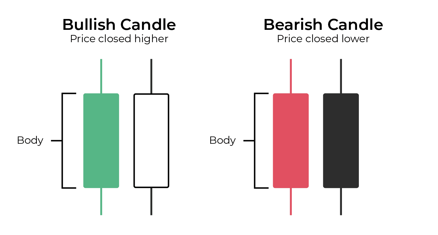
The color simply tells you direction:
Close above open → upward movement
Close below open → downward movement
But the real information isn’t the color.
It’s the relationship between these four points.
Two stories happening inside every candle
A single candlestick is doing something more interesting than it looks like.
It is recording both intent and rejection at the same time.
Think of it less like a line moving through space, and more like a system responding to pressure.
There is a simple way to frame it:
The body shows what actually held.
Or, in UX terms, it is like watching a button that got clicked 1,000 times, then immediately “undone” 500 times by users who changed their mind. The final state is what matters, but the hesitation tells you something important happened along the way.1. The Body → What Actually “Held”
The body shows the distance between where price started and where it ended. This is the part that “stuck.”
If the body is large then price moved decisively in one direction
If the body is small then price didn’t go very far overall
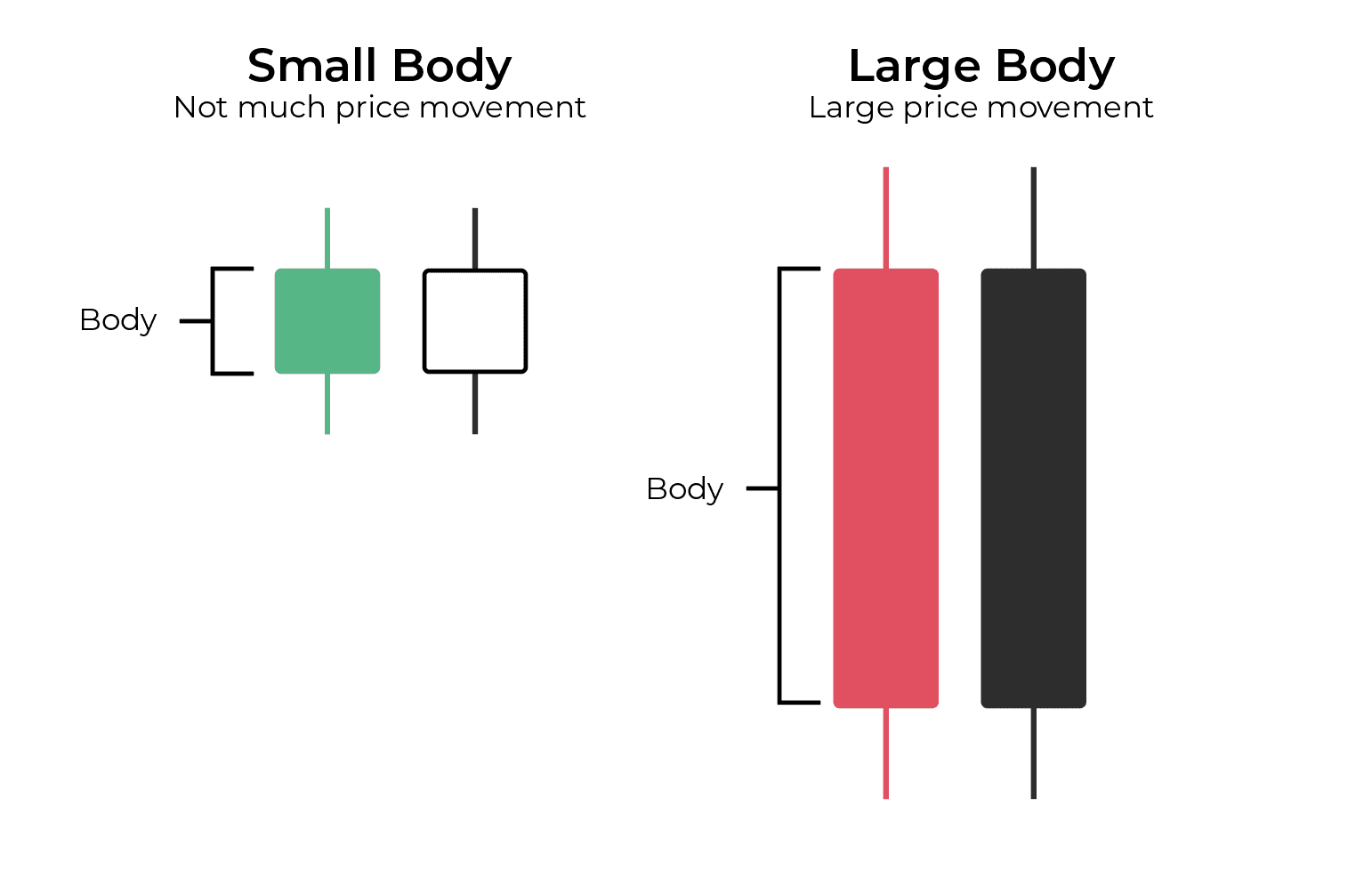
Think of the body as: What the market agreed on (for now)
2. The Wicks → What Was Rejected
The wicks show where price went but didn’t stay.
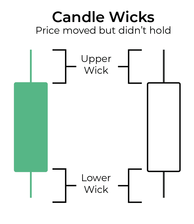
If you see a long wick:
price reached that level
but couldn’t hold it
It tells you:
where there was resistance (above)
or support (below)
Think of wicks as where the market explored—and said “no”.
Putting It Together
Every candle becomes a simple question:
Did price move with conviction? (body)
Did it get pushed back? (wicks)
You’re not just looking at movement. You’re looking at attempts and responses.
The UX Designer’s Shortcut
Here’s the fastest way I’ve found to read candles:
Scan the bodies first. Ignore the wicks.
This is basic visual hierarchy.
Your brain processes larger, more dominant shapes first.
The body is:
thicker
more visually prominent
easier to compare across candles
So start there.
Ask:
Are bodies getting larger or smaller?
Are they mostly in one direction?
Only then:
look at the wicks for nuance
Trying to read everything at once slows you down.
Reading in layers makes it faster and clearer.
Your First Pattern to Look For
If you’re just starting, don’t try to memorize dozens of candlestick patterns.
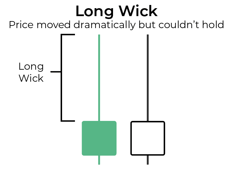
Start with one simple observation: Look for Long wicks + small bodies
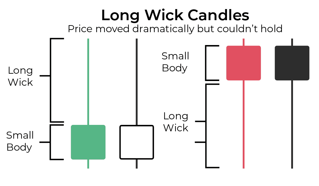
What it often means:
price moved up or down
but couldn’t hold that move
and ended close to where it started
In plain terms this shows indecision.
You’ll often see this when the market is pausing or deciding what to do next. Which means you should probably pause too, and make sure you understand what's going on.
What to Do With This
Open a chart in TradingView.
Scroll through and look for candles with long wicks and small bodies
Don’t try to trade them. Just notice where they appear and what happens after.
That’s how pattern recognition starts.
Closing Thought
A candlestick isn’t a signal to act.
It’s a compact way of showing:
movement
hesitation
and response
Once you stop seeing candles as colors—and start seeing them as behavior over time, the charts become much easier to read. And a lot more interesting.
FAQ's
Q: What are the most important candlestick patterns to learn?
Q: Should beginners use indicators or price action?
Q: What is the best way to learn to read candlestick charts?
Table of Contents
About Me

Krista Weber
After years as a VP of UX and a career in edtech, I retired early.
A few months later, I got bored enough to start learning trading.
What I didn’t expect was how much of UX thinking still applied. Just in a much more immediate and unforgiving environment.
This site is my attempt to learn it properly, and make the process clearer for anyone trying to do the same.
Stay in Touch
Say Thanks
Read More
Options flow backtesting has real methodological challenges — data availability, survivorship bias, and the impossibility of knowing intent. Here's how to approach it honestly.
Updated on