
Support & Resistance: Why Repeated Tests Matter
A level tested many times isn't necessarily stronger than a fresh one. It's more recognized, and recognition creates both opportunity and risk... Many experienced traders watch for exhaustion at frequently-tested levels rather than assuming they'll hold forever.

Learning Path Stage 2: Reading Charts
Learning Level 2: Understanding
Primary Learning Objective
By the end of this article, you should be able to evaluate the psychological and mechanical shifts that occur during repeated tests of support and resistance levels, enabling them to identify when a level is likely to hold versus when it is exhausted and ripe for a breakout.
Now that you know who actually shows up at support and resistance (see "What Buyers and Sellers Are Actually Doing at Support" and the resistance companion piece), here's what happens when they show up more than once.
Why Levels Have Memory
Prices aren't random. At specific price levels, economic events accumulate: traders enter long positions, short sellers enter short positions, stop orders are placed, and profit targets are set. All of these create concentrated supply or demand at specific prices.
The first time price reaches one of these levels and reverses, it's because the supply or demand there was enough to halt and turn the move. But the level doesn't disappear after that reversal. The participants who interacted with price there (those whose positions worked and those who got stopped out) retain memory of that level. When price returns, they interact with it again.
Key Takeaway: Support and resistance levels persist over time because they are price points where a significant amount of trading activity occurred, and traders remember.
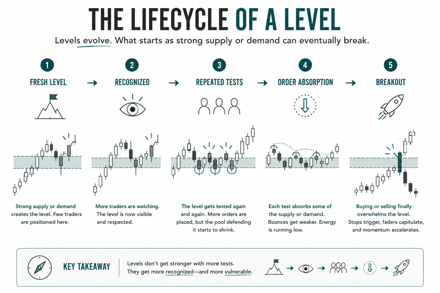
The Lifecycle of a Level
1. The Psychology of a First Test
Imagine price rises to a level where a large number of sellers previously accumulated short positions. It hits that level, supply overwhelms demand, and price falls.
The Sellers: Those who shorted at that level now have profitable positions. They may be holding, waiting for more profit, or partially taking profit.
The Buyers: Those who tried to buy at that level (assuming the uptrend would continue) are now in losing positions or have been stopped out. They now know this level is significant because they experienced it personally.
2. The Second Test: Anticipation
When price returns to the same level, the psychology has shifted.
Traders who missed the first reversal are watching, ready to participate if it holds again.
The sellers from the first reversal may add to their shorts, assuming the level will hold.
The buyers who got burned the first time either avoid the level or wait for confirmation before entering.
This concentration of attention, more traders watching, more positioned to react, often means the second test is sharper. The level is "known," and reactions can be swift.
3. Third and Beyond: The Energy Question
This is where it gets more nuanced. A level tested three or more times has repelled price multiple times, which sounds strong. But with each test, the underlying dynamics degrade:
Supply/Demand Depletion: Supply (at resistance) is partially depleted. Each time sellers push price away from the resistance level, some take profit and exit. The pool of sellers defending the level shrinks with each successful defense.
Positioning for the Break: As successful tests pile up, the level becomes extremely well-known. Traders who expect it to fail start positioning for the eventual break, buying at resistance in anticipation of a breakout, rather than selling there.
Traps are Set: Both institutional and savvy retail traders know stops are clustered just above resistance and just below support. A false break above the resistance level triggers these stops, briefly creates upward momentum, then reverses sharply as the buyers behind the false break take profits. This is the "liquidity grab" or "fakeout", a pattern that uses repeated-test psychology against the traders who have been successfully playing the level.
What to Look For
When you see price returning to a level that's been tested before, evaluate these core signals:
First and second tests: Often worth noting as potential reaction points. Fresh levels with limited previous touches tend to have more unconsumed supply or demand.
Third or more tests: Monitor for signs of weakness in the reaction. Is the bounce getting smaller? Is the reversal candle less decisive? Are subsequent candles failing to move far from the level? These suggest the level's energy is fading.
Increasingly shallow bounces: If price bounced 30 pips on the first test, 20 on the second, and 10 on the third, the level is likely being absorbed. The eventual breach may be close.
Volume context (if available): Look for decreasing volume on defense of the level alongside increasing volume on the approach. This pattern suggests pressure is shifting toward a break.
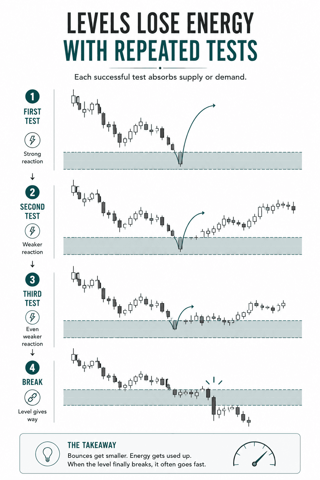
The Level That Breaks
When a well-tested level finally breaks, the move is often significant due to purely mechanical reasons:
Stops get triggered: Stops set just beyond the level get hit, adding sudden momentum to the break direction.
Faders capitulate: Traders who were fading the level (betting it would hold) are suddenly caught in losing positions and forced to exit, adding more fuel to the move.
Breakout traders join: Momentum traders enter on the confirmed break, extending the run.
This is why breakouts from well-established levels (especially after multiple tests) can produce some of the largest and fastest moves in the market.
A level tested many times isn't costly or inherently stronger than a fresh one. It's simply more recognized, and recognition creates both opportunity and risk.
Success Criteria
You will know you have mastered this concept when you can:
Differentiate between the market dynamics of a fresh first/second test and a heavily fatigued third/fourth test of a price level.
Identify key signs of level absorption, such as increasingly shallow bounces and shifting volume dynamics.
Anticipate the mechanical causes behind a major breakout, including stop-loss clustering and the capitulation of traders fading the level.
Common Misconception
The more times a support or resistance level is tested and holds, the stronger and more unbreakable that level becomes.
The Truth: While repeated tests increase a level's visibility, they actually deplete the underlying supply or demand defending it. Each successful test absorbs a portion of the orders placed there, making the level progressively weaker and increasingly susceptible to a sudden, highly volatile breach.
FAQ's
Q: Is the first test or the fourth test more significant?
Q: What's the difference between a test and a breach?
Q: Does more tests of a level always mean stronger support or resistance?
Table of Contents
About Me

Krista Weber
After a career as a VP of UX and EdTech executive, I retired early—and quickly realized the traditional world of trading education is fundamentally broken.
As someone with a Master’s in HCI who specialized in the design of e-learning systems, I saw a massive gap: beginners aren't failing because trading is impossible; they’re failing due to massive cognitive overload and terrible instructional design.
This site bridges that gap. I’m applying the principles of learning science, systems thinking, and minimalist UX to strip away the market noise and teach trading the way it actually should be taught.
Stay in Touch
Some of the pages on my travel blog contain affiliate links. Whenever you buy something through one of these links, I get a small commission at no extra cost to you. As an affiliate, I only recommend products and services that I feel are high quality and helpful to my readers. Thanks for your support.
Read More

Open almost any trading platform and you'll see EUR/USD sitting next to XAU/USD, NQ, ES, and a dozen CFDs on stocks you've heard of. They all show up as candlesticks moving left to right, which quietly implies they're all the same kind of thing. They aren't. Before going deeper into any one of them, it's worth drawing the map.
Updated on Sep 6, 2026

Futures are standardized contracts tied to defined specifications and a future settlement date. They can look complex at first, but the mechanics become much clearer once you know what the contract specification controls. Here's what you actually need to know.
Updated on Sep 6, 2026

CFDs appear everywhere in retail trading – but most new traders couldn't explain exactly what they are or why that matters. Here's a plain-language breakdown, including the parts that most introductions skip.
Updated on Sep 6, 2026