
Mark the Resistance Before I Do (Chart Markup Exercise)
The companion drill to marking support. Same method, same grading system, pointed at the ceiling instead of the floor. This exercise trains you to identify, draw, and grade resistance levels before seeing whether price actually respects them.

Learning Path Stage 2: Reading Charts
Learning Level 3: Application
Primary Learning Objective
By the end of this lesson, you will be able to objectively filter a 4H or daily chart to identify, draw as zones, and grade (A through D) the 3 to 5 most structurally significant resistance levels over a 6 to 12-month period, ensuring your bias does not under-mark overhead ceilings.
This exercise assumes you are using the exact same framework taught in "How to Draw Support and Resistance": Look Left, draw zones instead of lines, and confirm with round-number confluence. If you haven't read that piece yet, start there first.
What Resistance Actually Is
Resistance is where sellers have previously overwhelmed buyers. It is the visual area where the balance of power shifted from buyers pushing price up to sellers absorbing that demand and turning it back. Price returns to these levels because a meaningful number of market participants established positions, placed stops, or set targets there the last time price arrived.
It isn't magic, and it isn't a secret belief system either. Enough participants watch the exact same levels that their collective behavior at those prices creates the reaction. It is a entirely self-fulfilling loop.
The practical takeaway is simple. Levels with more historical reactions on higher timeframes are watched by more participants, meaning they tend to produce more reliable rejections. Levels with only one weak touch, or those buried on a low timeframe, are ignored by the broader market and behave far less consistently.
Reality Check: If you are marking a resistance zone because of a single rejection wick on a 5-minute chart during lunchtime volume, you are drawing a ghost. Stick to where the real volume stepped in.
Before You Draw: What Makes a Resistance Level Valid
Before you start coloring your chart with rectangles, a valid resistance level requires a few strict structural minimums:
At least two significant touches: You need two price reactions at roughly the same level. The more touches you find, the more significant the level becomes because each touch confirms that real participants were active at that price.
A meaningful reaction at each touch: Look for a visible stall, a clear rejection, or a sharp reversal. A touch where price barely paused before continuing higher is not a valid touch.
Clarity without overreach: The level should stand out. If you are squinting at your monitor to make price sort of line up with your zone, it is probably not a real level.
Timeframe appropriateness: A daily chart level completely outweighs a 15-minute one. When you are marking resistance for context on a 4H chart, weight daily levels and above as your primary reference points.
The Exercise
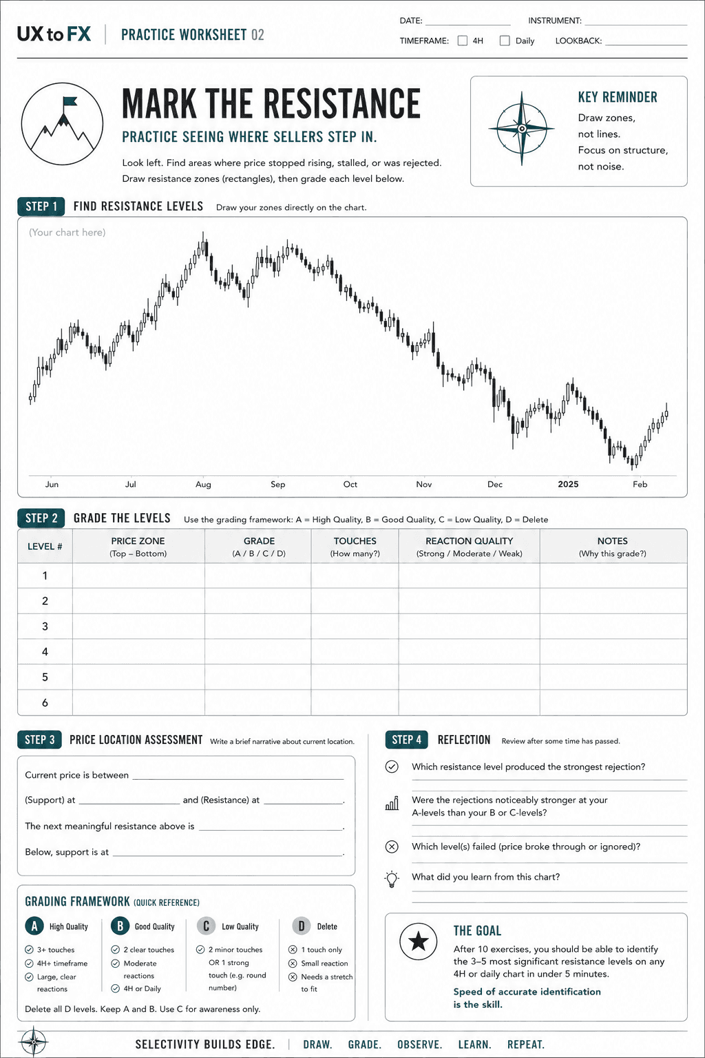
Open up any instrument on TradingView using the 4H or daily timeframe. Scroll back to see roughly 6 to 12 months of price history, which should give you about 200 to 400 candles to work with.
Step 1: Find Resistance Levels (10-15 minutes)
Moving left to right across your visible chart, look for price areas where:
Price stopped rising and reversed.
Price stalled significantly before continuing, meaning consolidation zones count.
Price returned and was rejected multiple times.
A prior support level broke and is now being retested from below.
Draw horizontal rectangles to represent zones at these areas. Annotate each one briefly, using labels like "strong resistance, 3 touches" or "former support, now likely resistance, broke 2 months ago."
Step 2: Grade the Levels (5 minutes)
Assign each level a strict grade based on its merit:
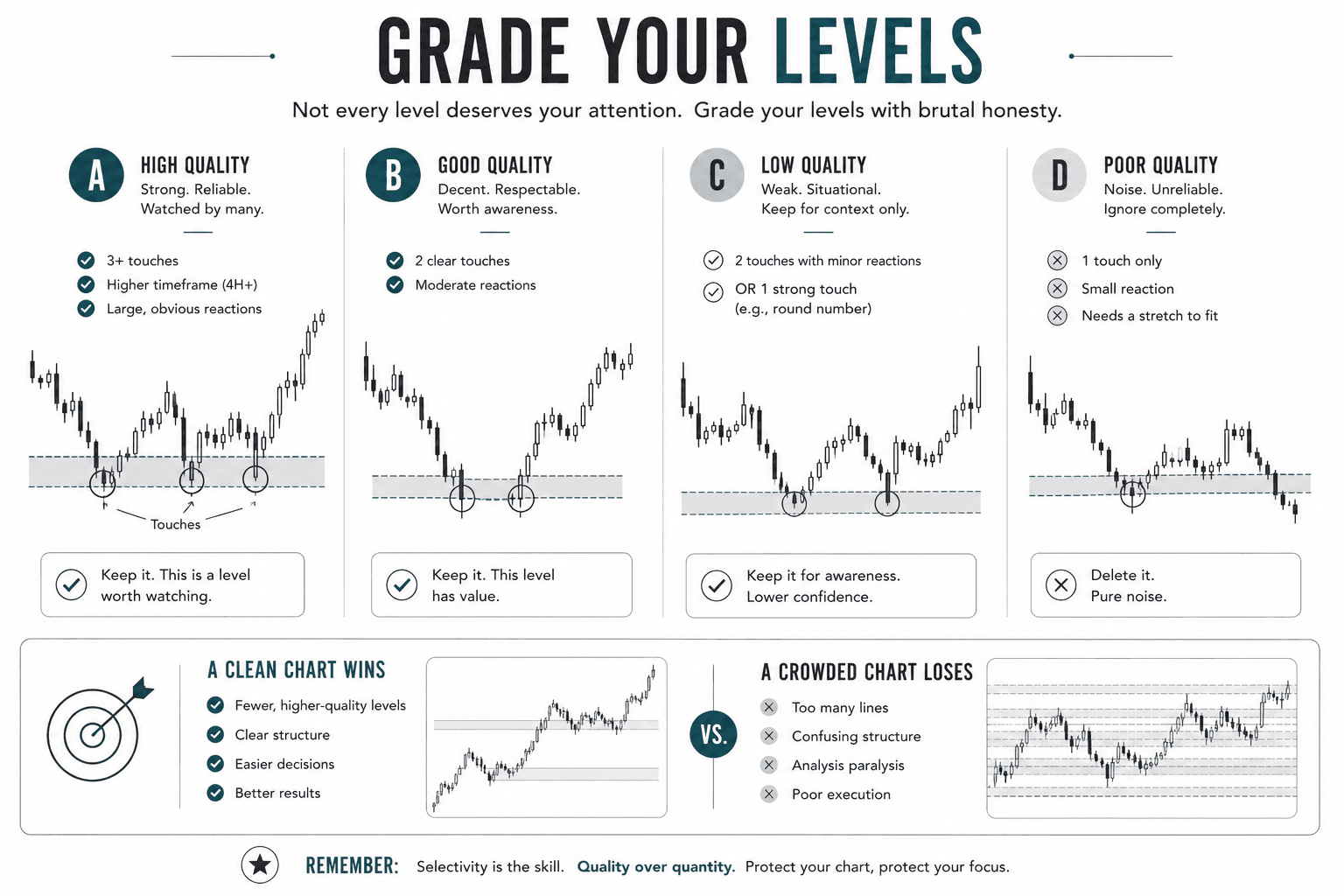
A: Multiple touches (3+), on a 4H timeframe or higher, featuring large reactions that are clear and unambiguous.
B: Two clear touches with moderate reactions on the 4H or daily chart.
C: Two touches but minor reactions, or one single strong touch with clear psychological significance like a major round number.
D: One touch, a small reaction, or a level that requires a very generous interpretation.
Delete all of your D-grade levels immediately. They are pure noise. Your final chart should consist mostly of A and B levels, with a few C-grade levels kept strictly for overall awareness.
Step 3: Price Location Assessment (5 minutes)
Where does the current price sit relative to your marked levels?
Below a significant resistance? That level is your ceiling, where sellers are expected to defend on a rally.
Above a prior resistance that is now likely support? That is your floor.
At a resistance level right now? This is a potentially active decision point.
Write a short narrative for your trading log: "Current price is between Level A support at [price] and Level B resistance at [price]. The next meaningful level above is [price]. Below, support is at [price]."
Step 4: Verify Against Your Prediction (Next Session or Next Day)
Come back after some time has passed and check your work:
Did price actually react at any of your marked levels?
Were the rejections noticeably stronger at your A-grade levels than your B or C-grade ones?
Did price slice through any of your levels like they weren't even there?
This live feedback loop is the ultimate training mechanism. Over many repetitions, it calibrates your eyes, strips away bias, and builds actual confidence in your structural lines.
Common Mistakes to Correct
Drawing too many levels: A chart covered in horizontal lines is completely useless. Selectivity is the entire skill. If your chart looks like a spreadsheet, you missed the point.
Marking every prior high: A high that price simply touched once on its way somewhere else is not resistance. It needs a real reaction to count.
Treating levels as exact lines: If you draw a level at 1.1050 and price gets rejected at 1.1057, your level was not wrong. Price reached the zone. Levels are windows, not exact ticks.
Under-marking resistance because you are naturally bullish: If you are always looking for longs, it is easy to wave off overhead resistance as a minor speed bump. Grade it with the exact same rigor you would apply to a major support floor.
The Benchmark
After completing 10 markup exercises across different instruments, you should be able to identify the 3 to 5 most significant resistance levels on any 4H or daily chart in under 5 minutes.
If it is still taking you 15 minutes or more, increase your practice volume. If you are consistently marking 15 or more levels per chart, tighten your filter. Speed of accurate identification, not exhaustive coverage, is the exact skill you are building here.
Resistance is simply where other traders decided "enough" before you got there. Your only job is to find that decision and use it as your reference point.
Success Criteria
You will know you have successfully mastered this lesson when you can look at any fresh 4H or daily chart and confidently execute the following:
Map supply zones accurately: Draw horizontal rectangles instead of exact lines, incorporating a clear margin of 10 to 20 pips (or 0.3% to 0.5% of price) to capture historical seller rejections.
Filter out weak data: Discard all "D-grade" levels (single touches or minor wiggles) to preserve absolute chart clarity and avoid over-marking.
Identify flipped structures: Spot and separate role reversal levels (broken former support) from fresh, untested prior highs, accounting for their unique near-term reliability.
Formulate an overhead narrative: Write a clear, 3-point price location assessment identifying your immediate ceiling (resistance), active floor (support), and the next logical decision point above.
Meet the speed benchmark: Complete the entire identification, grading, and filtering process for any instrument in under 5 minutes.
Common Misconception
Every prior high on a chart is a resistance level worth marking.
The Truth: Most of them aren't. A level only earns the name if price actually reacted there, a stall, a reversal, a rejection wick, not just a point where price happened to turn around once before continuing on its way.
FAQ's
Q: How precise should a resistance level be: an exact price or a zone?
Q: Is a broken support level now acting as resistance graded the same way as a "regular" prior high?
Q: I've already done the support version of this exercise. Is resistance really different enough to need its own drill?
Table of Contents
About Me

Krista Weber
After a career as a VP of UX and EdTech executive, I retired early—and quickly realized the traditional world of trading education is fundamentally broken.
As someone with a Master’s in HCI who specialized in the design of e-learning systems, I saw a massive gap: beginners aren't failing because trading is impossible; they’re failing due to massive cognitive overload and terrible instructional design.
This site bridges that gap. I’m applying the principles of learning science, systems thinking, and minimalist UX to strip away the market noise and teach trading the way it actually should be taught.
Stay in Touch
Some of the pages on my travel blog contain affiliate links. Whenever you buy something through one of these links, I get a small commission at no extra cost to you. As an affiliate, I only recommend products and services that I feel are high quality and helpful to my readers. Thanks for your support.
Read More

Open almost any trading platform and you'll see EUR/USD sitting next to XAU/USD, NQ, ES, and a dozen CFDs on stocks you've heard of. They all show up as candlesticks moving left to right, which quietly implies they're all the same kind of thing. They aren't. Before going deeper into any one of them, it's worth drawing the map.
Updated on Sep 6, 2026

Futures are standardized contracts tied to defined specifications and a future settlement date. They can look complex at first, but the mechanics become much clearer once you know what the contract specification controls. Here's what you actually need to know.
Updated on Sep 6, 2026

CFDs appear everywhere in retail trading – but most new traders couldn't explain exactly what they are or why that matters. Here's a plain-language breakdown, including the parts that most introductions skip.
Updated on Sep 6, 2026