
The Zone Between Levels: When Nothing Is Nearby
Some of the most dangerous chart locations are the ones where price sits in open space between two significant levels. No support nearby, no resistance overhead, nothing to lean on. Here's what to do when you find yourself looking at that kind of chart.

Learning Path Stage 2: Reading Charts
Learning Level 4: Analysis
Primary Learning Objective
By the end of this lesson, you will be able to diagnose when a market is trading in the "empty zone" between major support and resistance levels, map the nearest boundaries to define your risk, and decode price momentum within open space to avoid entering low-probability, unanchored trades.
Stop Trading the Ghost Town. Start Reading It.
Traders talk constantly about what to do at support and resistance like they’re holy shrines. But almost nobody talks about what happens between them.
Which is hilarious, because that’s where price spends about 80% of its life… just drifting around in the financial wilderness. It’s price sitting above a broken support like a cartoon character who just ran off a cliff and hasn't looked down yet. It’s price wandering aimlessly between the last significant low and the next significant high.
Price moves. Candles form. Indicators flash green and red like a broken Christmas tree. It all looks incredibly tradeable.
But without a structural anchor nearby, most of those signals are just the market coughing into the microphone.
What Makes a Location "Empty"?
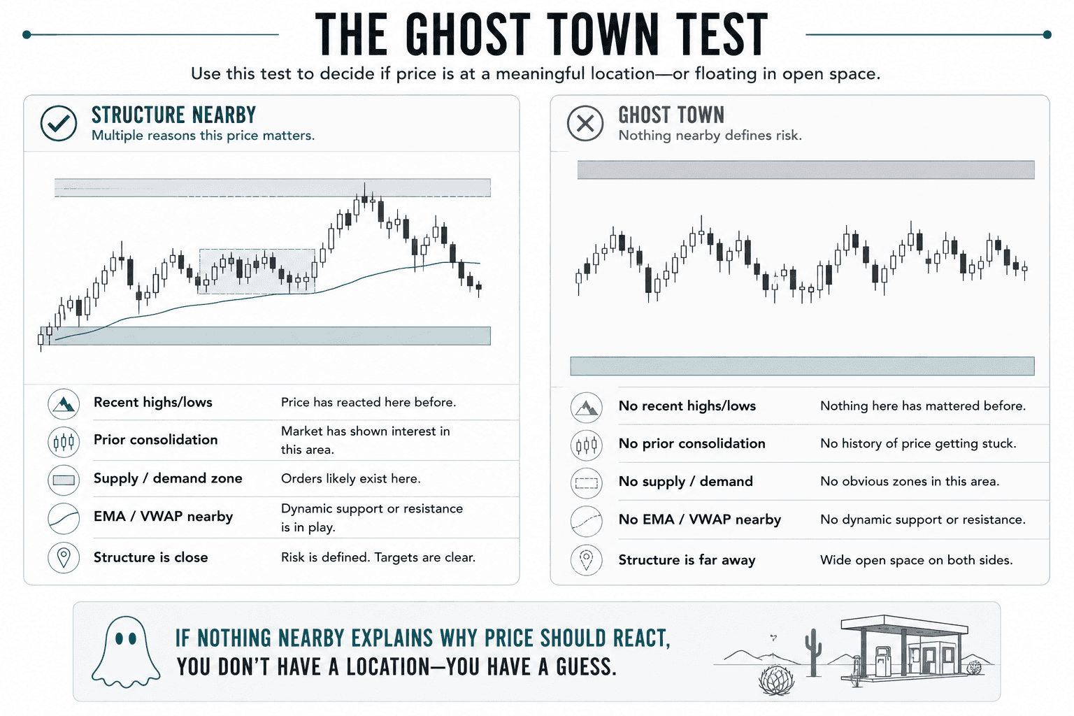
A between-levels location is the chart equivalent of a creepy, abandoned gas station in the middle of Nevada. You’ll know you’re there if you see:
Zero historical drama: No significant highs or lows anywhere near the current price.
No traffic jams: No prior consolidation zones where price previously got stuck.
Ghost town vibes: No obvious supply or demand zones from recent history.
No safety nets: No VWAP, EMA, or structural lines acting as a floor or ceiling.
The Grand Canyon effect: The nearest significant structure sits miles above and miles below you.
Mark your key levels. Look at where price is right now. If it’s sitting in a massive void with wide-open space on both sides, congratulations: you’re trading in the matrix.
Three Common Scenarios (And How to Handle Them)
Scenario 1: The Breakout Hangover
Price spent three weeks consolidating like a coiled spring between $1.1200 and $1.1350. It finally bursts above $1.1350 with massive momentum. Now it’s sitting at $1.1380, comfortably above broken resistance, but far below the next major milestone at $1.1500.
The old ceiling ($1.1350) should theoretically now be the new floor. Price hanging out in open space suggests the breakout is legit, but buying right here at $1.1380 is FOMO talking.
The Plan: Sit on your hands and wait for a pullback to $1.1350. Watch for a hold and a bounce. That's a valid setup at a level. Clicking "buy" in no-man's-land at $1.1380 gives you zero structural protection.
Scenario 2: The Mid-Air Retracement
Price is in a beautiful uptrend, but it decides to take a breather and pulls back from its last high. Right now, it’s floating in mid-air, below the swing high, above the swing low, and close to absolutely nothing.
The Plan: Chasing price as it falls through thin air is a great way to catch a falling knife. Instead, map out where the pullback is actually likely to run out of steam (a previous swing low, Fibonacci retracement, or a higher-timeframe EMA). Wait for price to hit that specific target and flash a trigger.
Scenario 3: The News Bomb Void
A high-impact economic report drops, and the chart goes absolutely wild, gapping and printing massive candles. Now the chaos has paused, and price is stalling in a region with zero historical context.
The Plan: This is the ultimate "empty zone." Because price rocketed through this territory at warp speed, no actual market structure or orders were built here. Don't guess the turn. Wait for price to actually build a new level through fresh consolidation before you risk your capital.
The "Sit on Your Hands" Waiting Framework
When price is stuck in the void, your primary job isn't trading, it's knowing what you're waiting for.
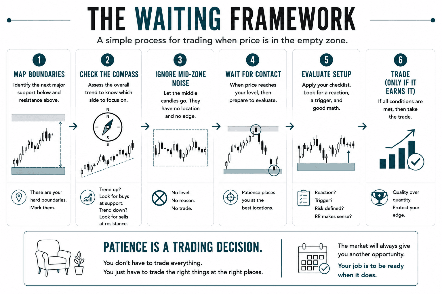
Map the Coordinates: Identify the next major level above and below. These are your hard boundaries. Mark them clearly so you don't hallucinate a trade.
Check the Compass: Assess the overall trend. If the trend is up, you’re looking to buy support; if it's down, you're looking to short resistance. Simple.
Ignore the Siren Song: Let the mid-zone candles go. A massive, juicy candle forming right in the middle of nowhere looks tempting, but it has no structural logic. If you enter there, where does your stop go? Where is your target? Your risk-to-reward ratio will look like a disaster.
Wait for Contact: When price finally hits your pre-marked level, then apply your checklist. Does it react? Is there a clear trigger candle? Does the math make sense?
Watch for New Settlements: If price camps out in the empty zone for days without hitting either extreme, the market is building a new home. Adjust your chart to reflect the new structure forming right in front of you.
How to Read the Emptiness
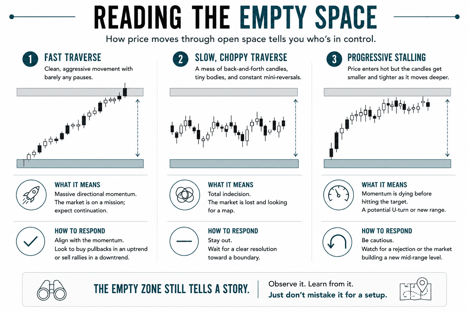
Just because you aren't trading in the empty space doesn't mean you shouldn't watch it. How price crosses the void tells you exactly who is winning the war:
Price Behavior | What It Looks Like | What It Actually Means |
Fast Traverse | Clean, aggressive candles slicing through the zone with barely any pauses. | Massive directional momentum. The market is on a mission; expect continuation. |
Slow, Choppy Traverse | A mess of back-and-forth candles, tiny bodies, and constant mini-reversals. | Total indecision. The market is lost and looking for a map. Stay out until a clear resolution happens. |
Progressive Stalling | Price enters hot but the candles get smaller and tighter as it moves deeper into the zone. | Momentum is dying before hitting the target. It’s either building a new mid-range level or preparing for a U-turn. |
What Comes Next
Recognizing you're hanging out in open space is only half the battle. Once price actually reaches a level, you have to ask yourself the ultimate question: "Is This Structure Worth Trading?", which is a comprehensive checklist designed to stop you from trading trash setups.
A blank wall is not a canvas. Between levels, your first task is simply realizing you're standing in an empty room.
Success Criteria
To prove you've mastered this concept, you should be able to:
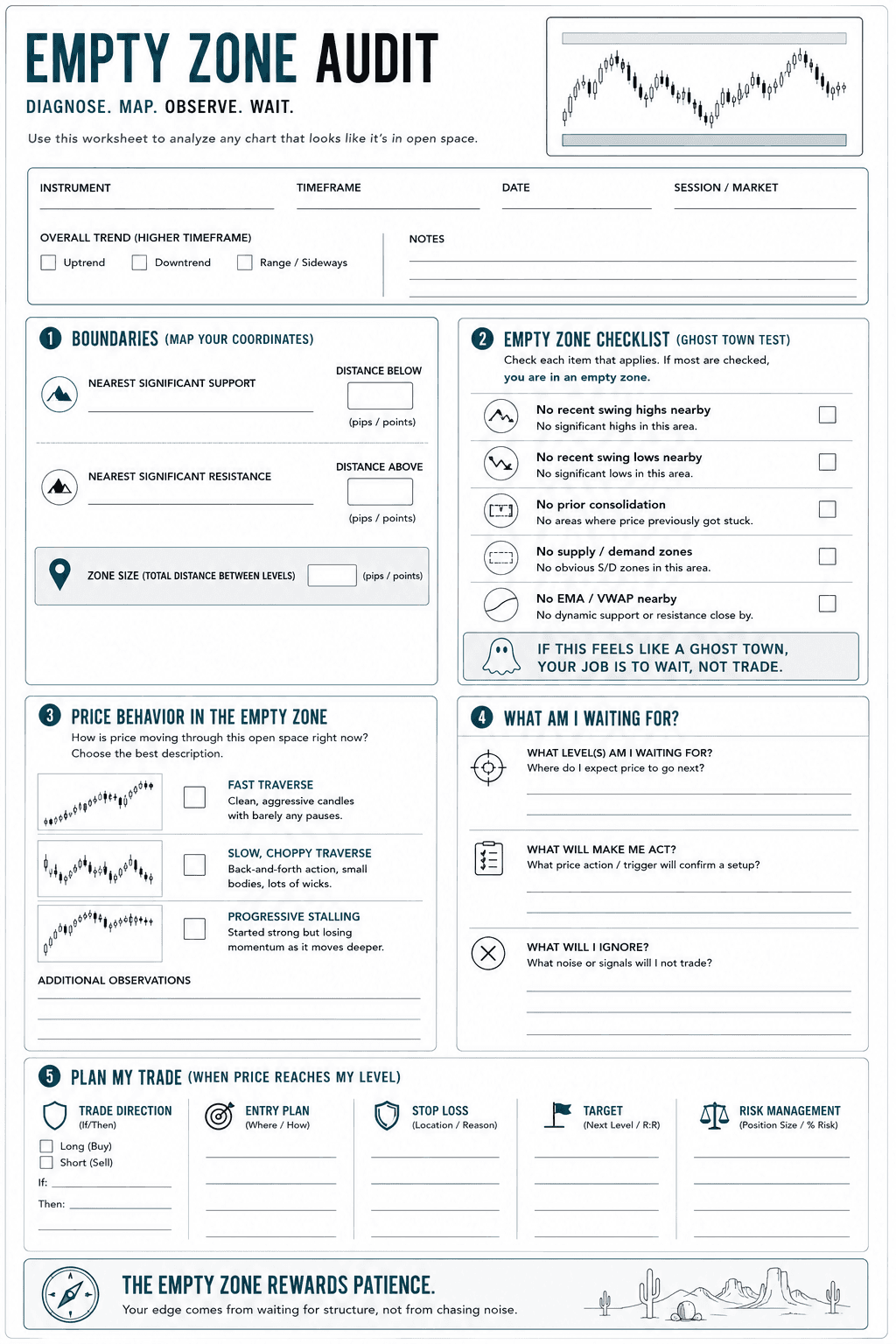
Audit any live chart and instantly identify an "empty zone" using the 5-point profile (no recent highs/lows, no historical consolidation, no supply/demand zones, and no key EMAs/VWAP nearby).
Differentiate between true level consolidation and mid-space stalling by checking historical reference points on a higher timeframe.
Map out a strict waiting framework for an asset in open space, explicitly defining the boundaries where you will look for a trade and the exact mid-zone signals you will intentionally ignore.
Analyze price character in real-time to categorize a traverse as fast (momentum), choppy (indecision), or stalling (fading), and explain how that behavior changes your overall trading bias.
Common Misconception
If price is moving and candles are forming, there’s a trade to be found somewhere in there.
The Truth: Without a nearby structural level to define risk and a target, most of what looks tradeable in open space is noise dressed up as a signal.
FAQ's
Q: Can you trade in the middle between levels?
Q: What does it mean when the market consistently lives between levels?
Q: How do I know if price is "in the middle" or actually consolidating at a level?
Table of Contents
About Me

Krista Weber
After a career as a VP of UX and EdTech executive, I retired early—and quickly realized the traditional world of trading education is fundamentally broken.
As someone with a Master’s in HCI who specialized in the design of e-learning systems, I saw a massive gap: beginners aren't failing because trading is impossible; they’re failing due to massive cognitive overload and terrible instructional design.
This site bridges that gap. I’m applying the principles of learning science, systems thinking, and minimalist UX to strip away the market noise and teach trading the way it actually should be taught.
Stay in Touch
Some of the pages on my travel blog contain affiliate links. Whenever you buy something through one of these links, I get a small commission at no extra cost to you. As an affiliate, I only recommend products and services that I feel are high quality and helpful to my readers. Thanks for your support.
Read More

Open almost any trading platform and you'll see EUR/USD sitting next to XAU/USD, NQ, ES, and a dozen CFDs on stocks you've heard of. They all show up as candlesticks moving left to right, which quietly implies they're all the same kind of thing. They aren't. Before going deeper into any one of them, it's worth drawing the map.
Updated on Sep 6, 2026

Futures are standardized contracts tied to defined specifications and a future settlement date. They can look complex at first, but the mechanics become much clearer once you know what the contract specification controls. Here's what you actually need to know.
Updated on Sep 6, 2026

CFDs appear everywhere in retail trading – but most new traders couldn't explain exactly what they are or why that matters. Here's a plain-language breakdown, including the parts that most introductions skip.
Updated on Sep 6, 2026