
Stage 3: Chart Patterns
Head and shoulders, flags, wedges, inside bars all taught visually, not with jargon.
Latest Articles from Stage 3: Chart Patterns

The Inside Bar Pattern (How to Read the Market Taking a Deep Breath)
An inside bar is a two-candle pattern where the second candle's high and low are both contained within the range of the first candle. The first candle (the "mother bar") engulfs the second. This containment signals a pause, indicating he market has compressed into a tighter range after a directional move. Inside bars are used as entry triggers and as precursors to breakout moves.
Date Published:
Read Time:
5
minutes

Why Humans Keep Drawing Faces in Charts
Humans are evolutionarily optimized for pattern recognition. That’s incredibly useful when identifying threats in the wild. It becomes slightly more problematic when staring at candlestick charts at 2:00 AM convincing yourself that a vaguely triangular formation “cannot fail.” This article explores why traders start seeing patterns everywhere, the psychology behind chart recognition, and the important difference between meaningful market behavior and your brain enthusiastically connecting dots that may not actually matter.
Date Published:
Read Time:
9
minutes

Double Top & Double Bottom: The Market’s “One More Try” Pattern
Date Published:
Read Time:
5
minutes

Head & Shoulders: The Chart Pattern Everyone Learns First
Most traders learn the Head & Shoulders pattern as a shape to memorize. But underneath the strange name and mountain-like structure is something much more important: momentum exhaustion. This article breaks down the psychology behind the pattern, why traders watch it, and how to stop seeing chart patterns as magic drawings and start seeing them as behavior stories.
Date Published:
Read Time:
10
minutes

Ascending vs Descending Triangles
One boundary holds, the other moves, and the side that is moving is the side showing increasing urgency. That moving side is where the lean comes from.
Date Published:
Read Time:
5
minutes
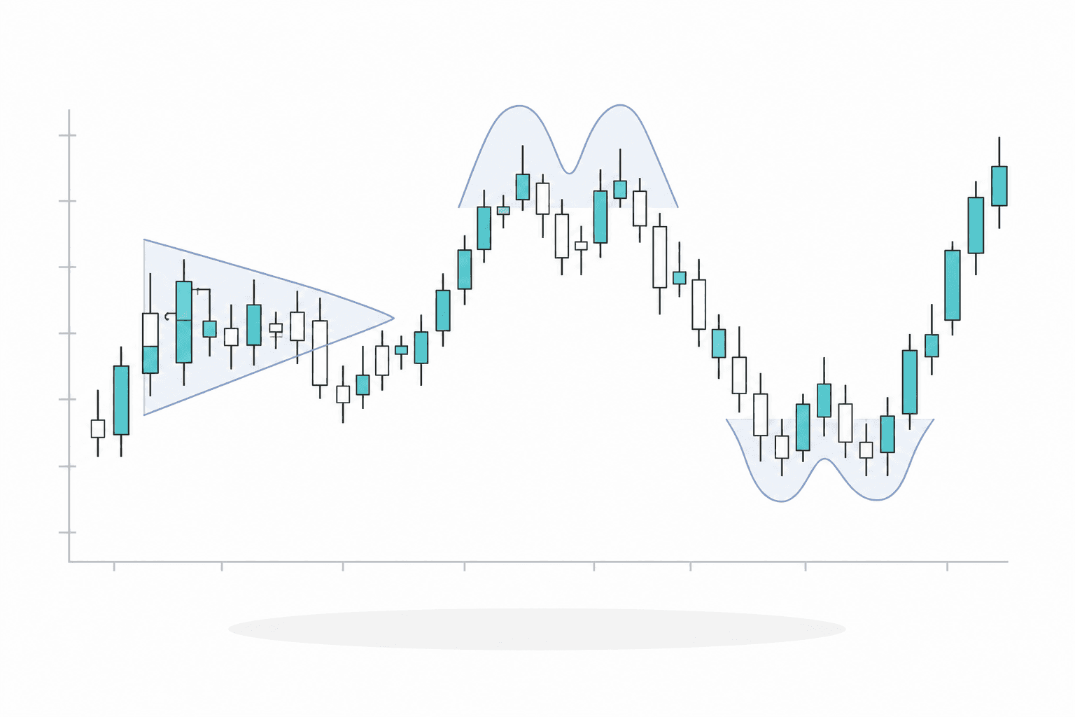
What Even Counts as a Chart Pattern?
A chart pattern is a recurring shape, but it only counts when the shape reflects a real behavioral situation. The name is shorthand. The behavior is the subject.
Date Published:
Read Time:
5
minutes
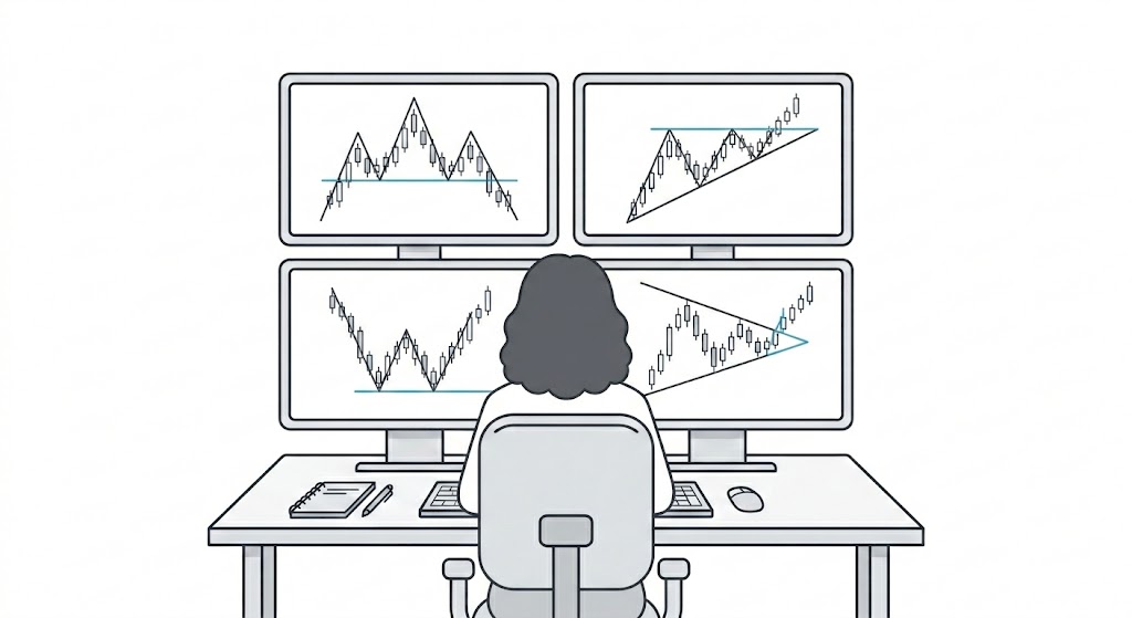
Why Chart Patterns Work (When They Do)
Chart patterns work when the behavior they describe is genuinely present and enough traders act on it. Treating them as probabilities, not promises, is the whole skill.
Date Published:
Read Time:
5
minutes
Read My Stories

Support isn’t a magical, invisible forcefield that price respects out of politeness. It’s a messy psychological battleground. Specifically, it’s a price area where, historically, enough buyers have shown up with their wallets open to halt a downward slide. Once you learn to identify who these buyers are and track their behavior, support stops being something you blindly hope holds and becomes something you can actually read
Updated on Jul 17, 2026
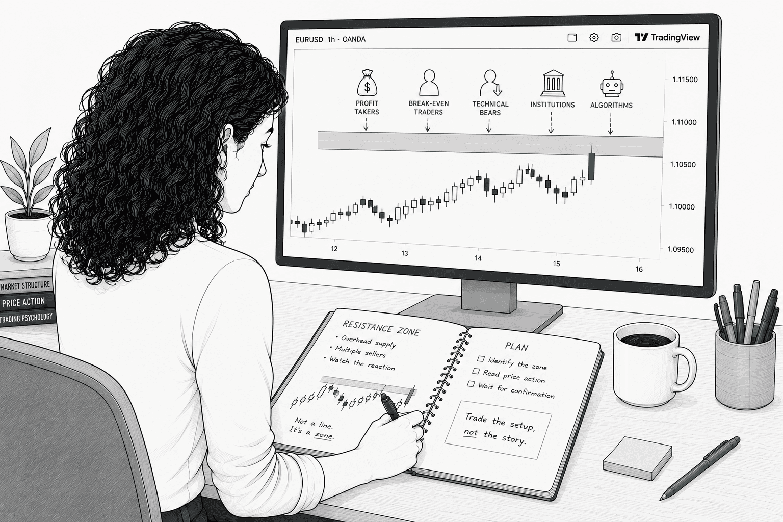
"Stops going up" isn't market magic or a spooky supernatural event. It’s the direct result of specific selling decisions made by specific human beings (and their robotic overlords) at a specific price for highly predictable reasons. Once you can name those reasons, resistance stops being a random line you're crossing your fingers and hoping holds. Instead, it becomes a map you can actually read.
Updated on Jul 17, 2026

A level tested many times isn't necessarily stronger than a fresh one. It's more recognized, and recognition creates both opportunity and risk... Many experienced traders watch for exhaustion at frequently-tested levels rather than assuming they'll hold forever.
Updated on Jul 20, 2026