
Stage 2: Reading Charts
Price action, candlesticks, support and resistance, trend structure. This is where pattern recognition — a core UX skill — starts to click.
Latest Articles from Stage 2: Foundations
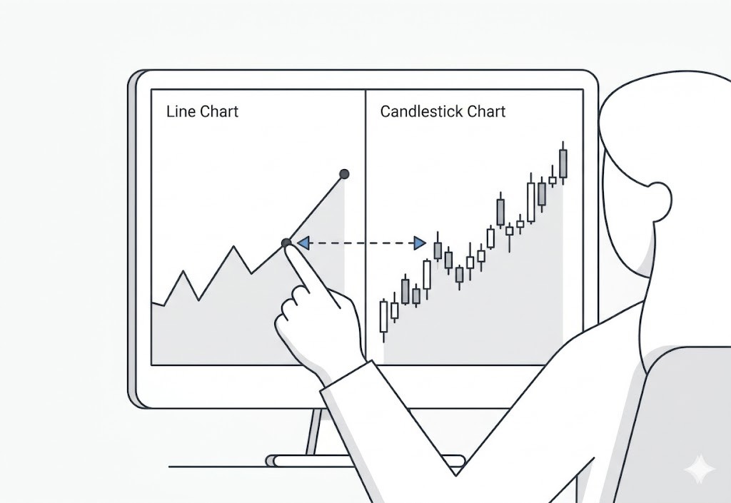
Why Candlestick Charts Exist
Most traders treat candlestick charts like a secret code of shapes to memorize. But they aren't secret signals. They’re just a compressed, visual record of a battle.
Date Published:
Read Time:
5
minutes
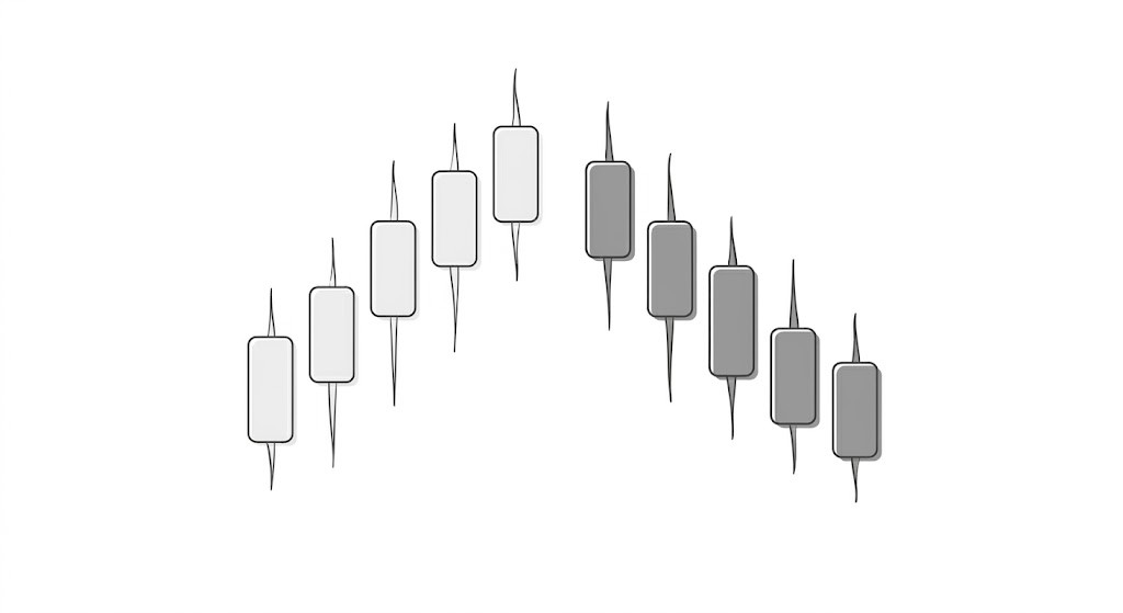
How I Actually Read a Candlestick Chart (Taught Like a UX Designer Would)
Not ‘a green candle means price went up.’ Let’s start with why this visualization exists; what information problem it was designed to solve.
Date Published:
Read Time:
8
minutes
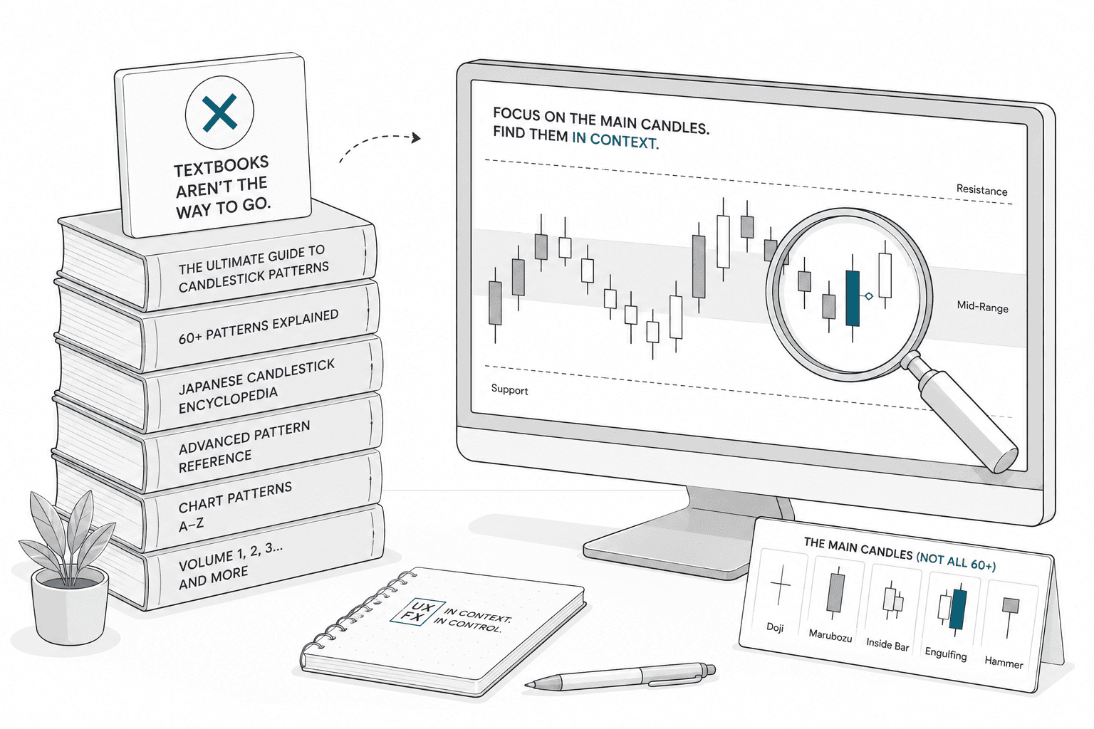
Candlestick Patterns That Actually Matter
There are over 60 named candlestick patterns. Most of them don't matter. Here's the short list of patterns that consistently carry information — and what they're actually telling you about the market.
Date Published:
Read Time:
7
minutes

Bullish vs Bearish Candles Without the Drama
Bullish and bearish candles carry far more emotional weight than they deserve. They are records of one finished period, not predictions or moral events.
Date Published:
Read Time:
5
minutes

Chart Reading: Identify the Regime First, Then Pick Your Trades
Most chart reading education teaches you how to read one type of market. The real skill is recognizing when the market has changed its character and adjusting what you look for, and how you read it, accordingly.
Date Published:
Read Time:
9
minutes

What Buyers and Sellers Are Actually Doing at Support
Support isn’t a magical, invisible forcefield that price respects out of politeness. It’s a messy psychological battleground. Specifically, it’s a price area where, historically, enough buyers have shown up with their wallets open to halt a downward slide. Once you learn to identify who these buyers are and track their behavior, support stops being something you blindly hope holds and becomes something you can actually read
Date Published:
Read Time:
6
minutes
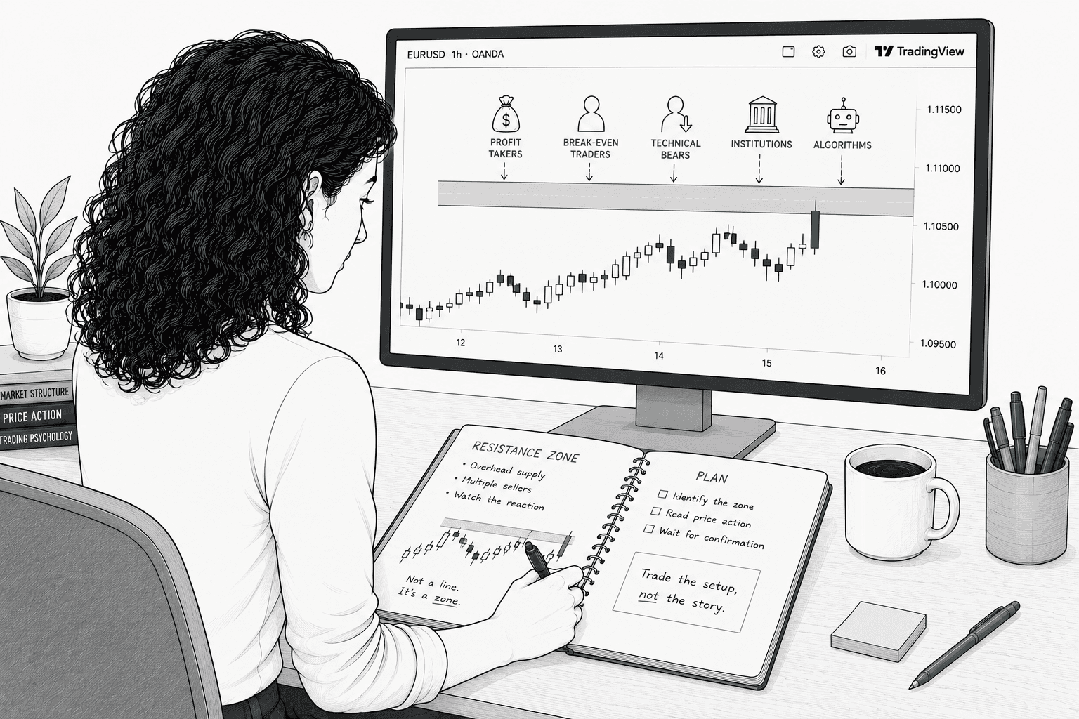
What Buyers and Sellers Are Actually Doing at Resistance
"Stops going up" isn't market magic or a spooky supernatural event. It’s the direct result of specific selling decisions made by specific human beings (and their robotic overlords) at a specific price for highly predictable reasons. Once you can name those reasons, resistance stops being a random line you're crossing your fingers and hoping holds. Instead, it becomes a map you can actually read.
Date Published:
Read Time:
5
minutes

Support & Resistance: Why Repeated Tests Matter
A level tested many times isn't necessarily stronger than a fresh one. It's more recognized, and recognition creates both opportunity and risk... Many experienced traders watch for exhaustion at frequently-tested levels rather than assuming they'll hold forever.
Date Published:
Read Time:
5
minutes

The Retest: What It Is and Why It Matters
Think a breakout means you missed the boat? Think again. The retest is the market’s way of checking its homework, offering savvy traders a second-chance entry that's cheaper, tighter, and way less stressful than chasing the initial surge. Here is how to spot a genuine role-reversal, and avoid getting caught in a breakout trap.
Date Published:
Read Time:
5
minutes

How to Draw Support and Resistance
Let’s be honest: 'price stopped going up' isn't a magical spell. It’s just the predictable result of human anxiety, greed, and specific math colliding at a single price point. If you can identify exactly who is pulling the trigger and why, resistance stops being a random line you're desperately hoping holds, and becomes a map of market psychology you can actually read.
Date Published:
Read Time:
7
minutes
Read More Stage 2 Articles
Most traders treat candlestick charts like a secret code of shapes to memorize. But they aren't secret signals. They’re just a compressed, visual record of a battle.
Updated on May 24, 2026
Not ‘a green candle means price went up.’ Let’s start with why this visualization exists; what information problem it was designed to solve.
Updated on Apr 16, 2026
There are over 60 named candlestick patterns. Most of them don't matter. Here's the short list of patterns that consistently carry information — and what they're actually telling you about the market.
Updated on Jun 11, 2026