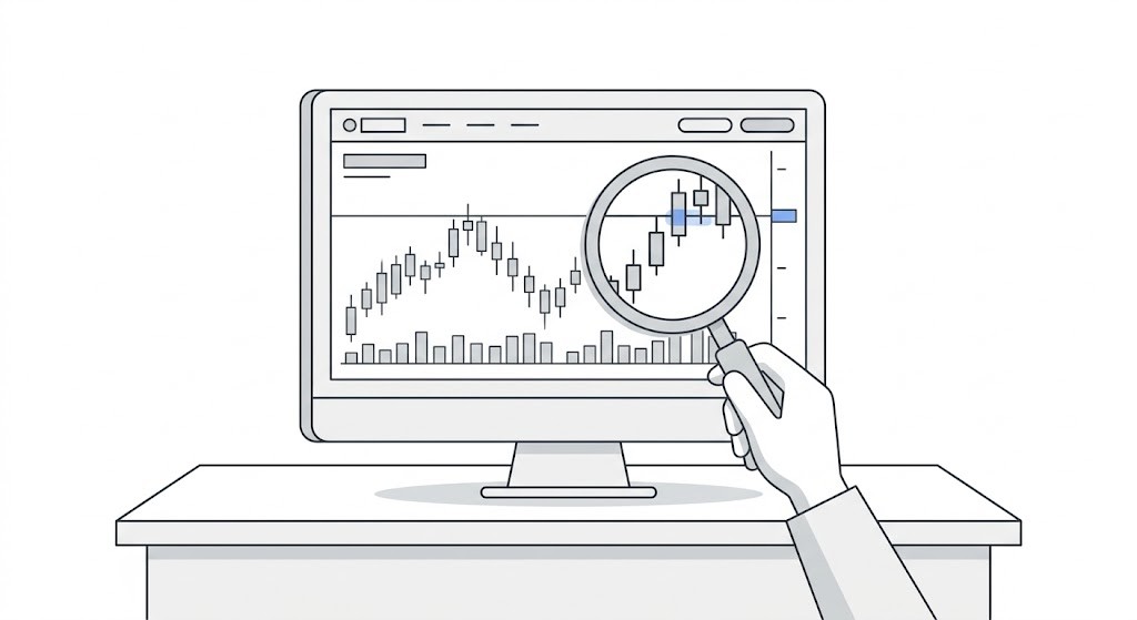
A laptop with a globe, a map and charts

Stage 2: Reading Charts

Price action, candlesticks, support and resistance, trend structure. This is where pattern recognition — a core UX skill — starts to click.

Latest Articles from Stage 2: Foundations
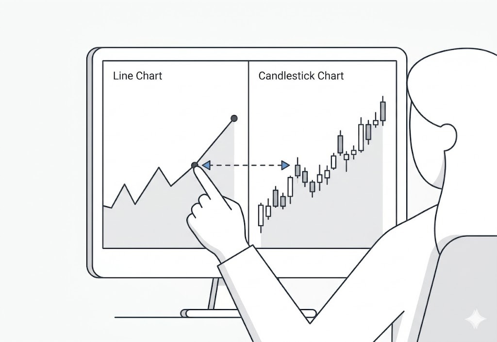
Illustration of a price chart approaching a support zone where buyers and sellers are preparing to compete. The image emphasizes that support is an active battle between buying and selling pressure rather than a single line on a chart.

What Buyers and Sellers Are Actually Doing at Support

Support isn’t a magical, invisible forcefield that price respects out of politeness. It’s a messy psychological battleground. Specifically, it’s a price area where, historically, enough buyers have shown up with their wallets open to halt a downward slide. Once you learn to identify who these buyers are and track their behavior, support stops being something you blindly hope holds and becomes something you can actually read

Date Published:

Read Time:

6

minutes
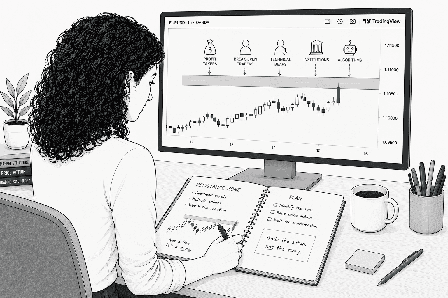
Hand-drawn illustration of a woman with shoulder-length dark curly hair studying a TradingView chart showing price approaching a shaded resistance zone. An open notebook beside the keyboard contains sketches of the resistance area and market observations, emphasizing that resistance is about understanding buyer and seller behavior rather than predicting price.

What Buyers and Sellers Are Actually Doing at Resistance

"Stops going up" isn't market magic or a spooky supernatural event. It’s the direct result of specific selling decisions made by specific human beings (and their robotic overlords) at a specific price for highly predictable reasons. Once you can name those reasons, resistance stops being a random line you're crossing your fingers and hoping holds. Instead, it becomes a map you can actually read.

Date Published:

Read Time:

5

minutes

Hand-drawn illustration of a woman with shoulder-length dark curly hair studying a TradingView chart showing multiple tests of a shaded support level. Each bounce becomes progressively smaller as she sketches the pattern in an open notebook, illustrating how repeated tests can weaken support or resistance over time.

Support & Resistance: Why Repeated Tests Matter

A level tested many times isn't necessarily stronger than a fresh one. It's more recognized, and recognition creates both opportunity and risk... Many experienced traders watch for exhaustion at frequently-tested levels rather than assuming they'll hold forever.

Date Published:

Read Time:

5

minutes

Hand-drawn illustration of a woman with shoulder-length dark curly hair studying a TradingView chart showing a breakout above a resistance zone followed by a pullback to retest the level. An open notebook contains a simple sketch of the breakout and retest pattern, emphasizing patience and confirmation before entering a trade.

The Retest: What It Is and Why It Matters

Think a breakout means you missed the boat? Think again. The retest is the market’s way of checking its homework, offering savvy traders a second-chance entry that's cheaper, tighter, and way less stressful than chasing the initial surge. Here is how to spot a genuine role-reversal, and avoid getting caught in a breakout trap.

Date Published:

Read Time:

5

minutes

Hand-drawn illustration of a woman with shoulder-length dark curly hair studying a TradingView chart with several swing highs aligning into a shaded resistance zone. An open notebook contains sketches showing how multiple price reactions help identify support and resistance as zones rather than exact lines.

How to Draw Support and Resistance

Let’s be honest: 'price stopped going up' isn't a magical spell. It’s just the predictable result of human anxiety, greed, and specific math colliding at a single price point. If you can identify exactly who is pulling the trigger and why, resistance stops being a random line you're desperately hoping holds, and becomes a map of market psychology you can actually read.

Date Published:

Read Time:

7

minutes

Hand-drawn illustration of a woman with shoulder-length dark curly hair studying a TradingView chart while marking shaded support zones on a 4-hour price chart. An open notebook contains a hand-drawn chart with support zones and notes, emphasizing the practice of identifying market structure rather than predicting future price movement.

Mark the Support Before I Do (Chart Markup Exercise)

Support levels aren't handed to you. You have to find them. This markup exercise trains you to identify, draw, and grade support levels on real charts before seeing where price reacts, which is the only way to develop the skill that matters in live trading.

Date Published:

Read Time:

5

minutes

Hand-drawn illustration of a woman with shoulder-length dark curly hair studying a TradingView chart while marking shaded resistance zones on a 4-hour price chart. An open notebook contains a matching sketch with resistance zones and notes, emphasizing the practice of identifying where sellers previously entered the market.

Mark the Resistance Before I Do (Chart Markup Exercise)

The companion drill to marking support. Same method, same grading system, pointed at the ceiling instead of the floor. This exercise trains you to identify, draw, and grade resistance levels before seeing whether price actually respects them.

Date Published:

Read Time:

6

minutes

Hand-drawn illustration of a woman with shoulder-length dark curly hair studying a TradingView chart where price has reached a resistance zone. The completed candlestick shows a long upper wick and closes well below the resistance area, while an open notebook compares weak and strong rejection patterns to reinforce reading price action after the candle closes.

Reading Price Action at Key Levels

Drawing significant levels on your chart is a task most traders can do reasonably well. Reading price action when price arrives at those levels and distinguishing a high-quality signal from noise, or a genuine reaction from a momentary hesitation is the skill that takes longer to develop.

Date Published:

Read Time:

8

minutes

Minimal editorial illustration of a candlestick chart with a teal support zone near the bottom and a gray resistance zone near the top. A small cluster of candles drifts through the wide empty space between the two levels with no nearby structure, emphasizing the lack of support, resistance, or historical context.

The Zone Between Levels: When Nothing Is Nearby

Some of the most dangerous chart locations are the ones where price sits in open space between two significant levels. No support nearby, no resistance overhead, nothing to lean on. Here's what to do when you find yourself looking at that kind of chart.

Date Published:

Read Time:

5

minutes

Minimal editorial illustration of a candlestick chart showing price rejecting from a teal support zone with a strong bullish rejection candle. A small teal checkmark beside the level suggests the structure has successfully passed a quality evaluation. The graphic emphasizes that identifying a level is only the beginning of the trading decision.

Is This Structure Worth Trading?

Identifying structure is the precondition for trading it. But identifying structure doesn't mean the structure is worth trading. This article walks through the evaluation process for deciding whether what you've found on the chart actually meets the bar for a tradeable setup.

Date Published:

Read Time:

7

minutes

Read More Stage 2 Articles

Illustration of a price chart approaching a support zone where buyers and sellers are preparing to compete. The image emphasizes that support is an active battle between buying and selling pressure rather than a single line on a chart.

Support isn’t a magical, invisible forcefield that price respects out of politeness. It’s a messy psychological battleground. Specifically, it’s a price area where, historically, enough buyers have shown up with their wallets open to halt a downward slide. Once you learn to identify who these buyers are and track their behavior, support stops being something you blindly hope holds and becomes something you can actually read

Updated on Jul 17, 2026

Hand-drawn illustration of a woman with shoulder-length dark curly hair studying a TradingView chart showing price approaching a shaded resistance zone. An open notebook beside the keyboard contains sketches of the resistance area and market observations, emphasizing that resistance is about understanding buyer and seller behavior rather than predicting price.

"Stops going up" isn't market magic or a spooky supernatural event. It’s the direct result of specific selling decisions made by specific human beings (and their robotic overlords) at a specific price for highly predictable reasons. Once you can name those reasons, resistance stops being a random line you're crossing your fingers and hoping holds. Instead, it becomes a map you can actually read.

Updated on Jul 17, 2026

Hand-drawn illustration of a woman with shoulder-length dark curly hair studying a TradingView chart showing multiple tests of a shaded support level. Each bounce becomes progressively smaller as she sketches the pattern in an open notebook, illustrating how repeated tests can weaken support or resistance over time.

A level tested many times isn't necessarily stronger than a fresh one. It's more recognized, and recognition creates both opportunity and risk... Many experienced traders watch for exhaustion at frequently-tested levels rather than assuming they'll hold forever.

Updated on Jul 20, 2026

We use cookies to improve your experience. By continuing, you agree to our cookie policy.